Wednesday, 21 October 2015

visual narrative: when the Bible is a comics


I am not sure at what age I started identifying the Bible with a brick volume of thin pages filled with two columns of text in a very small type. The Bibles that I have owned (and those that I have not owned) all look the same - whatever the language.  As a result, I was genuinely excited when I first discovered Robert Crumb's comic Bible. It had the colour, the fun and the passion of a great story. Later, I found this vibrant storytelling in Medieval manuscripts, churches, interiors.


Visual story telling has long been used in religious education of illiterate or semi-literate population. V&A Cast Court Collection has Hildesheim doors (1015) on display. They are decorated with images from the Creation of Eve to Christ appearing to St Mary Magdalen. Churches frequently have stained glass windows and statues showing sequences of Biblical scenes, to aid the less educated with their knowledge of the Testaments. Visual narrative allows engagement of a more diverse "reader", as  a result, wider communication and bigger impact on the religious thought.

Here is 12th century manuscript Bible of Stephen Harding . Folio 13 features the story in a format of a comic. I have not managed to find out much about the manuscript, except, that it is held at Bibliothèque municipale de Dijon and some scanned folios can be found HERE


Manga Bible is a spectacular publication of the best manga drawing. A five-volume manga series is based on the Christian Bible and created under the direction of the non-profit organization Next, formed by people from the manga industry. Though first published in English, the books are originally written in Japanese and each volume is illustrated by a Japanese manga artist. Each book is adapted from the Bible by Hidenori Kumai.


And then there is Robert Crumb's Genesis ( Nominated for three 2010 Will Eisner Comic Industry Awards) and Nestor Redondo + Joe Kubert's DC Comics Stories from the Bible : both are fabulously edgy, risque and fresh; in contrast to many others, which are roughly interchangeable with a range of books seen in Christian bookshops' windows. This is what Crumb said to Paris Book Review:
In all the comic-book versions I was able to find, they just made up dialogue, pages of it that are not in the Bible. I was reading this one thing and I thought- did I miss this? And I went back and checked against the text and it’s not in there. And they claim to be honoring the word of God, and that the Bible is a sacred text… the most significant thing is actually illustrating everything that’s in there. That’s the most significant contribution I made. It brings everything out.
 Could his comic version of the Bible be the most honest one yet?


Nestor Redondo and Joe Kubert's DC Comics Stories from the Bible was printed in 1975 and covers the stories from Creation to Sodom & Gomorrah.


by Egidija


→ books & braille: reading with the fingertips


↓ 

At BABE earlier this year I met a Norwegian artist Randi Strand. Randi's work reflects on the physicality and meaning of language signs, exploring relationship between signifier and signified. Randi showed me her recent book BERØRINGSSTROFER, which runs a Norwegian text alongside a text in Braille. Norwegian words are printed in a gently raised glossy ink. A bind person would be able to read the Braille and detect the physical presence of another text without being able to read it. A sighted person, on the other hand, will be able to read the Norwegian text (subject to the knowledge of Norwegian!) and see the presence of Braille as asemic writing. This beautifully light and poetic book combines tactile and visual pleasure of reading.


When we close our eyes, the object between our fingers loses visual cues - such as title, text, colophon, index, images. Books become blank books - or libri illeggibile - books devoid of traditional attributes of book in favour of acoustic and tactile experience. (Reading Book as an Object, 2015)

Indeed, some books become less blank than the others: some books are produced for tactile reading and they can only be read with the fingertips. In those books materiality of the object merges with the verbal and the visual content into one tactile experience of a very physical reading. They are the books for the blind.

↓ 

David Rumsay Map Collection holds a 1837 embossed atlas for the blind. The atlas is printed in Boston Line Type - it was not until 20th century that New England Institution for Education of the Blind adopted Braille. 

L: Back of embossed New Hampshire map page. R: Explanation of New Hampshire map. From atlas of the united states, Printed for the use of the blind, at the expense of John C. Cray; under the direction of s.g. howe. at the n.e. institution for the education of the blind. Boston 1837.(SLATE)

L: Back of page holding explanation of Vermont map. R:New Hampshire map. From atlas of the united states, Printed for the use of the blind, at the expense of John C. Cray; under the direction of s.g. howe. at the n.e. institution for the education of the blind. Boston 1837. (SLATE)

↓ 

Contemporary embossed maps are produced by Princeton Braillists. The master drawings are duplicated by the Thermoform process to make clear, sharp copies onto plastic sheets, which are bound into volumes with cardboard covers and spiral plastic binders.


from OUTLINE MAPS OF THE WORLD

from ATLAS OF NORTHERN AFRICA

from BASIC HUMAN ANATOMY


A few years ago Illinois Rare Books and Manuscripts library found a 19th century Moon's "First illustrated reader": a book for blind children, published in Moon type and decorated with eight embossed illustrations.


Bellow is a beautiful contemporary Braille edition of Piccolo Principe, with embossed illustrations, including this image of a boa constrictor digesting an elephant.


A very promising appliance for the blind was featured in September 2015 issue of BBC Focus Magazine. BLITAB - a tablet which will allow the 285 million of blind and visually impaired individuals to finally enter the "tablet revolution". BLITAB is the first affordable (potentially) and light tablet for the blind. It was developed by an Australian startup: it creates Braille out of tiny, liquid-filled bubbles. Up to 15 lines of Braille can be displayed, while built-in software can convert text into Braille from websites or USB sticks. BLITAB can also display graphs, pictures, maps. It is expected to go on sale in 2016.


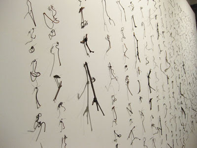
The final body of images come from a photographic work by the above mentioned Norwegian artist Randi Strand. Her series Memoria feature a set of seemingly insignificant images overprinted with Braille, forming a drawing of embossed writing.
The works are at the same time images of language and inaccessible language images. They conceal their message and convert communication into decoration. One language decorates another. She complicates them, takes them apart and reassembles them in new ways. She challenges us to ignore the meaning of signs and draws our attention to the signs as such, in other words, to the visuality of language – as form, movement, image. In this way the signs are emptied of their original meanings, without becoming meaningless in the process. (text by Mari Aarre)


Monday, 27 July 2015

→ illegible writing (almost)/ #asemic

Some time ago I had a pleasure to see Bruno Munari's libre Illegible at Estorick Collection in London. Libre illegible contained no texts, titles or tables of content. Instead, they could only be "read" as a tactile, acoustic and visual experience. Libre illegible later became one of the key sources of inspiration for our project between one hand and another. Investigation into those illegible books has led me to uncover a world of non-textual "reading" and "writing" - visually beautiful illegible and almost-illegible pieces produced by writers, scientists, poets, artists, spies, adventurers and scribblers of all sorts: some - as a philosophical artistic investigation; some - as communication; others - as encrypted communication.

↓  philosophical artistic investigation


http://www.invaluable.com/auction-lot/bruno-munari-acrylic-on-paper-1587-c-f4c4b77917
Bruno Munari. Scrittura Illeggibile di un Popolo Sconosciuto

Bruno Munari himself had produced a series of works titled Scritture illeggibili di popoli sconosciuti (Illegible Writings of Unknown People), using asemic writing, based on Arabic and Chinese characters. Asemic writing implies presence of written communication. However, due to it's a-semic nature, interpretation relies on the implications drawn from visual information.


Cecil Touchon, Palimpsest Asemic Correspondence 
Cy Twombly, Letter of Resignation
http://bombmagazine.org/article/7461/untitled-and-diario-no-1-a-o-1
Mirtha Dermisache, Diario Noº 1 Año 1
http://www.cuifei.net/works/manus5.htm
Cui Fei, Manuscript of Nature V
Donna Maria de Creeft, Asemic Journal
Guy Beinin, So is the one (a visual poem)* 

Asemic script suggests presence of written communication. It relies on apophenia - a human tendency to see meaningful patterns where they do not exist.Of course, asemic witting is created by people who have experience of reading and writing texts in their native languages - it is based on the knowledge of what a legible written communication looks like. As a result, any asemic language can only exist as a conscious reduction of that experience and unconscious imitation of the languages the writer does not understand - which probably explains, why much of European asemic writing looks like Arabic or Asian scripts.

↓  communication

This is not really an example of illegible writing, rather it is an example of visually beautiful writing practice from the 19th century, when it was a custom to cross-write letters in order to save paper. It look only little experience, they say, to read and write successfully in this way, learning to ignore the overlapping text.


Jane Austen

Charles Darwin
Another 19th century example is a translation. It is produced by an Alaskan Eskimo shaman, who having converted to Christianity attempted to translate the Bible into his tribe’s native script. Biblical names are in English/Latin script -  as there was no equivalent. This page appears to be from Genesis 19, about the two angels who visited Lot, before Sodom and Gomorrah were destructed (currently at Basel Paper Mill, Museum for Paper, Writing and Printing).
 

↓  encrypted communication

 The most famous example of yet unresolved encrypted writing is Voynych Manuscript, of course. It is generally agreed that the manuscript is written in an unknown writing system. As speculations on the nature and the source of the text multiply, the manuscript remains undeciphered. It remains illegible, or - an example of a beautiful asemic writing.
Voynich manuscript
A rather better story lies behind The Copiale Cipher - a mysterious 18th century document that no one could read until 2011. The Copiale Cipher describes the rituals and some of the political ideals of a German secret society in the 1730s. Bellow is an interesting extract about one of the rituals involving reading.
The master places a piece of paper in front of the candidate and orders him to put on a pair of eyeglasses. “Read,” the master commands. The candidate squints, but it’s an impossible task. The page is blank. The candidate is told not to panic; there is hope for his vision to improve. The master wipes the candidate’s eyes with a cloth and orders preparation for the surgery to commence. He selects a pair of tweezers from the table. The other members in attendance raise their candles. The master starts plucking hairs from the candidate’s eyebrow. This is a ritualistic procedure; no flesh is cut. But these are “symbolic actions out of which none are without meaning,” the master assures the candidate. The candidate places his hand on the master’s amulet. Try reading again, the master says, replacing the first page with another. This page is filled with handwritten text. Congratulations, brother, the members say. Now you can see.


The Copiale Cipher

Every language is an example of encrypted communication: the message only makes sense to those who have the keys to decoding, those being vocabulary and grammar. Until we have the keys, the writing remains asemic to the individual reader: writing remains a drawing with a potential to be decoded.

Such as this Japanese calligraphy is to me.

Japanese poem by Lady Murasaki Shikibu from Ogura (early 13th century) 

めぐりあひて 見しやそれとも わかぬ間に 雲がくれにし 夜半の月かげ

 "Meeting on the path:

But I cannot clearly know If it was he,

 Because the midnight moon

In a cloud had disappeared." 

(calligraphy by yopiko)


[Egidija]

Wednesday, 24 June 2015

→ the photo book (part II): between documentation and memory (@ Photographers' gallery, London)


Georges Didi-Huberman has recently been awarded Theodor-W.-Adorno-Preis 2015, which is given for outstanding achievement in philosophy, music, theater or film. Some years ago he wrote Images In Spine of All, in which he discussed four explicit photographs of mass extermination in Nazi camps. Huberman put the voyeur, the history and the art into one line of questioning. Photography, he said, rested between documentation and memory.
A simple piece of film - so small that it can be hidden in a tube of toothpaste - is capable of engendering an unlimited number of prints, of generations and enlargements in every format. Photography works hand in glove with image and memory and therefore possesses their notable epidemic power. (Huberman, p24)

↓↓↓

As a Lithuanian, I must start this blog with Moshe Vorobeichic. In 1931 he published Paris (as Moi Ver), one of the very first photo artists' books ever produced. At about the same time, however, he published another photo book Ein Getto im Osten - Wilna (1931), documenting the Jewish quarter in Vilnius, where he himself grew up. Like Paris, Wilna book is equally avant-garde in it's collages and layouts. Yet, it is also a very intimate book: the viewer is brought very close to the faces, the puddles, the baskets of Vilnius Jews. The reader is led though the back streets and the markets; the reader looks at the rooftops and the pavement; the reader meets residents of the Jewish quarter. This book is not a record of a historical point in time, rather it is a personal reference point to somewhere in his childhood, soaked in black-and-white nostalgia.


↓↓↓

Photographers' Gallery at the moment is hosting a Chinese photo book exhibition curated by Martin Parr and WassinkLundgren. The exhibition space is tight, but there are large double-page-spread photos, videos of books, books to handle (albeit chained) and books to look at under the glass.


The exhibition does not solely focus on the artists publications, but brings together the whole range of photographic books, pamphlets, promotional material under one umbrella. There is no line between photo books as artists' publications and institutional albums, produced to document an aspect of research, such as tongue conditions or bridges. Does a distinction between photo book as a document and photo book as a creative practice, rest on the maker's intentions only, rather then certain qualities of the outcome? Ed Ruscha recorded gasoline stations, while Chinese government recorded bridges. Both resulted in photo books.


The Hairy People of China


Basics of soccer - a series of techniques

This merging of intentions is what I found so pleasing about the exhibition: there were instructions on the correct ways to play sports and then there were artists' publications, such as the beautifully cinematic  This Face portrait book by Xu Yong.


 Zi U's face was photographed during various times of the day: with make-up and without, tired and refreshed. She is a sex worker. She sees clients from very close and she is used to be seen from close. The sequence of photographs forms an intimate portrait similar to that produced by a film: the trace of the real Zi U is captured in-between the page spreads and the viewer, in-between proximity and truth, in-between memory and document.

Photographers' Gallery also contained an exhibition of Deutsche Börse Photography Prize 2015 (now closed). Mikhael Subotzky and Patrick Waterhouse - the winners - had the work in the first room for their mammoth long term project documenting the fate of Johannesburg's Ponte City. The prize was awarded "for their ambitious publication Ponte City (Steidl, 2014), charting the social and political history of a 54-floor apartment block in Johannesburg", which was built under apartheid rule in 1976 and was originally conceived as a center of aspirational living for a white elite.  A sequence of books follows the temporal line of events, with an introductory pamphlet - containing newspaper headlines - placed at the front. The narrative is built one step at a time by thoughtful sequencing of images and texts. The work balances between the space of historical documentation and artistic interpretation, merging the boundary between the the objective fact and subjective elucidation. 


↓↓↓

As a young teenager I collected photo books of my city. They were published once every few years. I did not own a camera - I documented my space and time in another way. Like those Chinese photo books - which show the correct way to play soccer - Kaunas photo books reflected the correct Soviet way to see my town. They are not voyeuristic (like Xu Yong's book), they are not nostalgic (like Moshe Vorobeichic book) and they only have the intimacy of a travel agent's photography. Yet, they stand as a document and they stand in for memory. Because they contain photographs.
Photographed images do not seem to be statements about the world so much as pieces of it, miniatures of reality that anyone can make or acquire. (Sontag, On Photography)


↓↓↓


1. Susan Sontag also argues against photo books, because they determine the order in which photographs are to be viewed. Like cinema, photo books sequence images as determined by artist's intentions. It is in the nature of the photo book to be sequenced. Yet, it is also in the nature of the book as such to accommodate a random access option for the viewer should one desire to exercise such.


References:

images Egidija's own, except for M. Vorobeichic (Moï Ver), Ein Ghetto im Osten – Wilna, 1931, which were taken from achtung.photgraphy website.


Didi-Huberman, G (2008), Images in Spite of All: Four Photographs from Auschwitz, Chicago: University of Chicago Press.
Sontag, Susan, On Photography http://www.susansontag.com/SusanSontag/books/onPhotographyExerpt.shtml, June 21, 2015.


[Egidija]